
tips for selecting a simple photo card

I usually design our holiday photo cards myself, but since most people choose their cards from a big vendor, I thought I'd share a few tips for selecting a simple photo card, be it for the holidays, an announcement or an invitation.

Photos
It's easy to choose a great card if you start with good photos - and they don't have to be professionally taken.
I photographed the kids in my office wearing just the clothes they had on that day (I added shoes and a sweatshirt for Owen). There were two big takeaways for me after taking those photos.
Keep it simple.
I used a plain wall in our house, natural light, and a few ornaments to keep their hands occupied (Owen kept crawling into the other room). If you're going for a simple look, try not to overthink backdrops and sets and stuff. If you like simple, then keep it simple.
Be patient, but if you're photographing kids, try to make it quick!
I can tell when I look at the photos that the kids got weary after even just a few minutes.
Get in, get out, and try not to get upset with your three-year old when he refuses to look at the camera.
This is supposed to be fun, right?!

Design
Let the Photos Shine
I prefer photo card designs that let the photos be the star of the card.
As you can see, this design isn't exactly a Picasso. It's just a couple of blocks of color, some simple text and that's it.
No bells, no whistles. No snowflake motifs.
In our card this year, I was definitely going for a more modern, minimalist and clean look in the photos, and the design matches that look. Very, very simple.
Match the design to the mood of the photo.
That said, a more elaborate design can certainly project a simple look overall.
My sister's friend manages to pick the perfect card from Minted every year. Last year, her family was all over the Minted homepage!
If you're going for a more elaborate design, make sure no one's face is obstructed by some kind of flourish and the colors match what's happening in the card with your outfits and the background.
A design that matches the "mood" of your photo (fun, sweet, silly, serious, light) can keep it all feeling simple and cohesive.
Oh, and a little white space goes a long way, even with a more elaborate design.

Color
Neutrals + a pop of color.
The boys are wearing navy, grey and brown and they're holding red and white ornaments.
To keep the design simple, I used those colors - and only those colors.
I didn't introduce green or yellow. I just used the colors that already appeared in the photos.
On the front, I liked the navy since there weren't any red ornaments in that photo.
Then when you flip the card, the red is a nice, festive surprise.
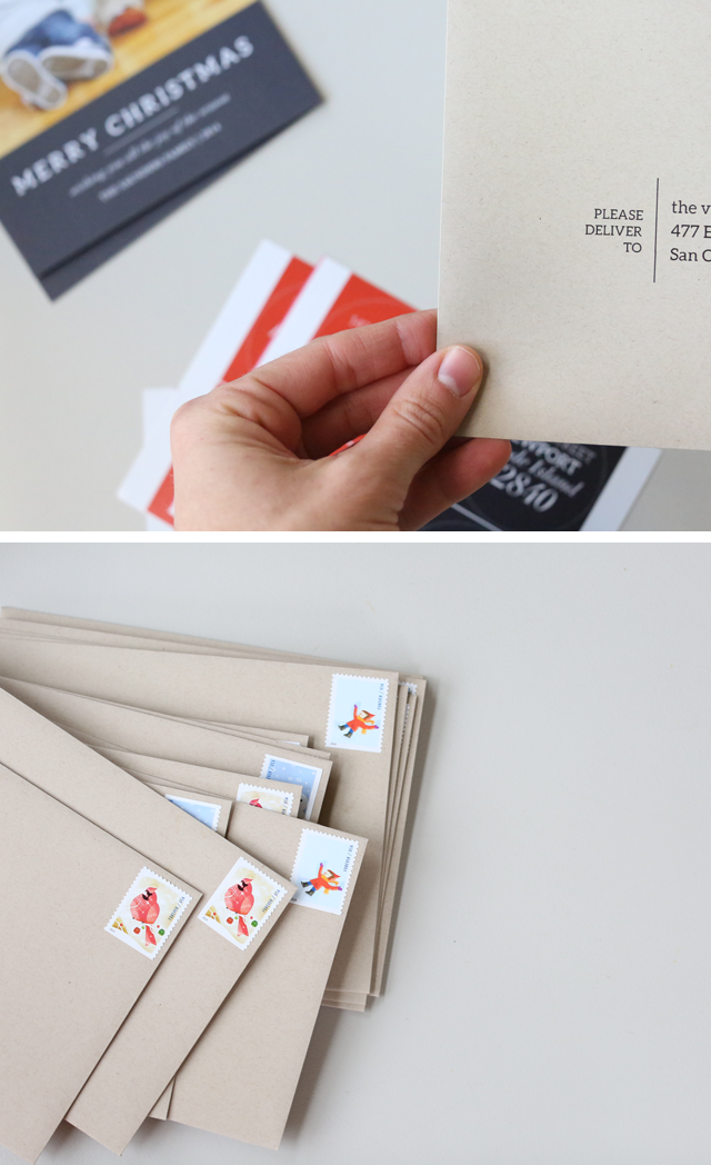
I also incorporated red and navy in the envelope by using those colors in the return address labels.
And I chose kraft envelopes to make it feel a bit more rustic and as a nod to the wood floors.
A little color goes a long way.
If you're selecting a card design on a site like Shutterfly, consider something that compliments the colors in your photos so it won't compete with them.
This and this are great examples of incorporating color.
If you like a particular design but the site you're using doesn't have it in your colors, then consider sending them an email.
You can also use something metallic or in neutral tones, which generally go with everything.

Make it personal
Simple design can sometimes feel a little sparse or aloof or "one note".
I think it's nice to add something that makes your card a bit more personal.
Include something handwritten - either a short note or an address.
I have to say I love the cards that have a handwritten note - even if it's just a "Happy new year, Saunders fam!"
It will differentiate your card from the pile and add just a tiny personal nod to your friends.
A short note says "yes, I'm busy, and we may not see each other this season, but I'm thinking of you beyond just being someone on my mailing list."
In this particular year, I wrote a short note on the outside of our envelopes since our cards didn't have space for one.
Trust me - these were tiny notes!
But it was fun to do on my end as well, as it got me thinking about where each card was going. If all you can do is get the cards in the mail, then that's great!
Hand-addressing is another easy way to add a personal touch to your cards (and frankly, it'll take you less time than it took me to fight with mail merge).
Details
You can really elevate a simple design with thoughtful details.
By "details" I mean stamps, envelopes, addressing, return address labels, all the little things that make up the finishing touches on a mailed card.
It may seem like a silly thing, and maybe it is, but simple design is in the details. Otherwise, I think it can look a bit random or generic.
I used the same fonts as the card on our return address labels and the addresses themselves.
I even picked stamps that looked kind of modern and minimalist.
Your recipients might not notice the stamp (let's be honest), but they'll get an overall "feel" of a cohesive design.
If you get your addresses organized early, you can take advantage of some of the big vendors' free addressing services, which will match your envelopes to the style of your card. SO cool.
Improve Your Photo Skills
Download my FREE video workshop. In it, I walk you through my favorite tips for capturing simple, bright, beautiful photos on your phone.