
How to design a no-frills Project Life layout
This month, I'm spending a lot of creative time documenting. I'm doing a lot of catch up this month on our little guy's baby Project Life album. Rather than making sure I document every day or every moment, I'm just including photos and journaling that I love, that reflect our life this year, and that show what Owen's doing these days (since technically it's his album).
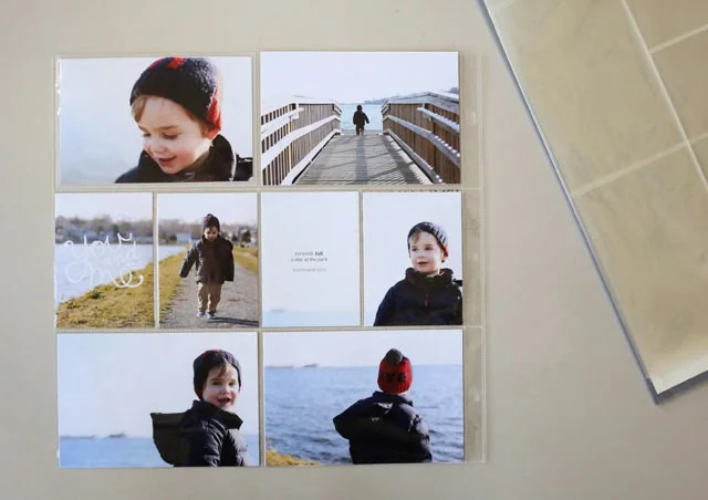
The biggest change with this approach is that if I have a group of photos I love, I go ahead and include as many of them as I want, even if they're all from just one day. Case in point: these shots from a random afternoon at the park with Ben back in November. I loved the photos and used them to put together a really simple layout. Here's how I did it.

Choose a group of similar photos
The thing I love about Project Life is that you can make it whatever you want, and that can change from page to page. I mostly create layouts with photos from different days, events, etc. So they're not all matchy-matchy. But for a really simple layout, try choosing photos that have a similar look, feel, exposure or color scheme. If you took a bunch of pictures while, say, the kids were playing in the snow, pick six of them and call it good. They'll have the same light and backgrounds, which will keep the look really simple.
Crop your photos before printing
I don't print my photos at home, so I crop them in Photoshop before uploading them to my photo printer of choice. You can do the same thing using the photo software that came on your computer. iPhoto allows you to crop to custom or standard sizes. You can do the same thing in Windows Photo Gallery if you're using a PC.
Why crop before uploading? Because you can control precisely what's in the shot, which means you'll get rid of excess background, or more effectively emphasize a close-up. If you're using the same pocket-page that I'm using in this layout, then you'll need some 3x4 photos, or at least a place to cut a 4x6 in half and not splice someone's face!
If you crop your own photos, you can ensure that your cuts will be in the right places. When I'm doing a photo-heavy layout like this, I like to make sure I have a mix of close-ups and more distant shots. It helps keep your eye moving around the layout and adds some asymmetry to the page.
Add a little bit of text or embellishment
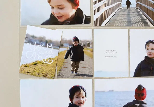
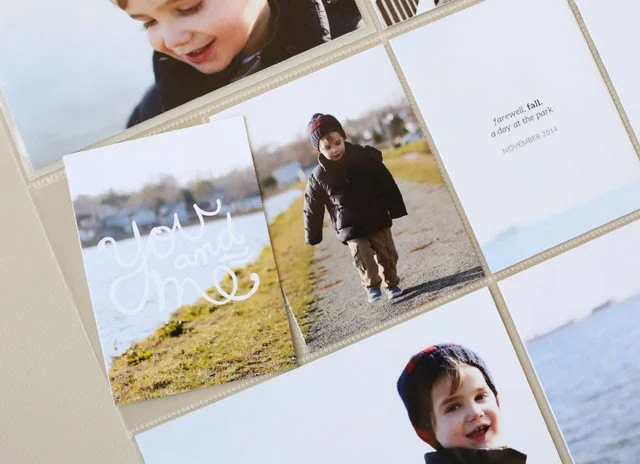
Because I'm able to type directly on photos before I send them to print, I just added some text to the left side of the two photos I knew I was going to cut in half. But you don't need Photoshop or a fancy program to add a little text. Simply swap out those two pockets with simple journaling cards. I use cards from the Midnight Edition, but my my go-to journaling cards are just plain white.
Cut a little white or kraft card stock to 3x4 inches, add the date and you're done. Or if you're into embellishment, add a little something to one of the 3x4 cards or photos. Keep it minimal, and this layout will be done and in your album in about 5 minutes.
I hope these tips help you do some quick and simple memory-keeping!
Products used | Paislee Press pics + words no. 6 / Project Life Design A pocket page
Resources | cropping tutorial for Windows / cropping tutorial for Mac