elements of simple design
Since I'm right at the start of a new project life album, I've been having to make lots of design decisions over the last few weeks: fonts, color schemes, etc.
I got several design questions related to the week "twelve" layout I shared over at paislee press, so I'm going with an idea I had to do a series on elements of simple design.
I came to memory-keeping via project life two years ago, and while I love its simplicity, I also love the varied approaches people take to it. There is no one way to do memory-keeping! My goal with this series is to share practical ways I try to incorporate simple style in my project life layouts.
First up: link layouts with parallel journaling cards
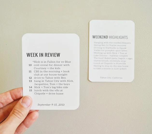
What does that mean? Well, take a look at these two cards:
I was inspired by the week in review cards from paislee press to include some sort of weekly summary that would appear in each layout throughout the album. But I found that I might need some more detailed journaling in any given week.
So I created another card that looks almost identical, which I might include in the facing layout, like this:
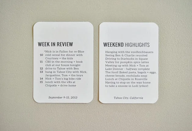
The right side is actually a draft of what ended up being the 12x12 collage you see HERE. In the end, I wanted to include more photos and I thought this looked too busy. But I liked the way the two summary journaling cards looked in the layout. Here's what they looked like in Photoshop:

The exact same fonts and the same spacing on both cards keeps them looking really parallel. For me, this helps unify two sides of one layout. If I continue to use these same templates throughout my album, they'll help create a link between various layouts, regardless of color scheme, photos, etc. Another added bonus? I don't have to make this decision again! For my next layout, I'll just open these files, change the text and hit "print."
Products:
project life 3x4 plain white cards // design inspired by week in review cards from paislee press // project life design A and design F pocket pages
Fonts:
Oswald Book (18pt) is the bolder all-caps text. Oswald light (18pt) is the thin all-caps text used for the word "highlights." The rest of the text is Aleo (10pt) either light, regular or light italic. Both Oswald (available HERE) and Aleo (available HERE) are free downloads!
In case you're not sure how to download and install free fonts, check out THIS tutorial. Also, you can read about how I print on my journaling cards HERE.
Questions? Feel free to leave a comment.