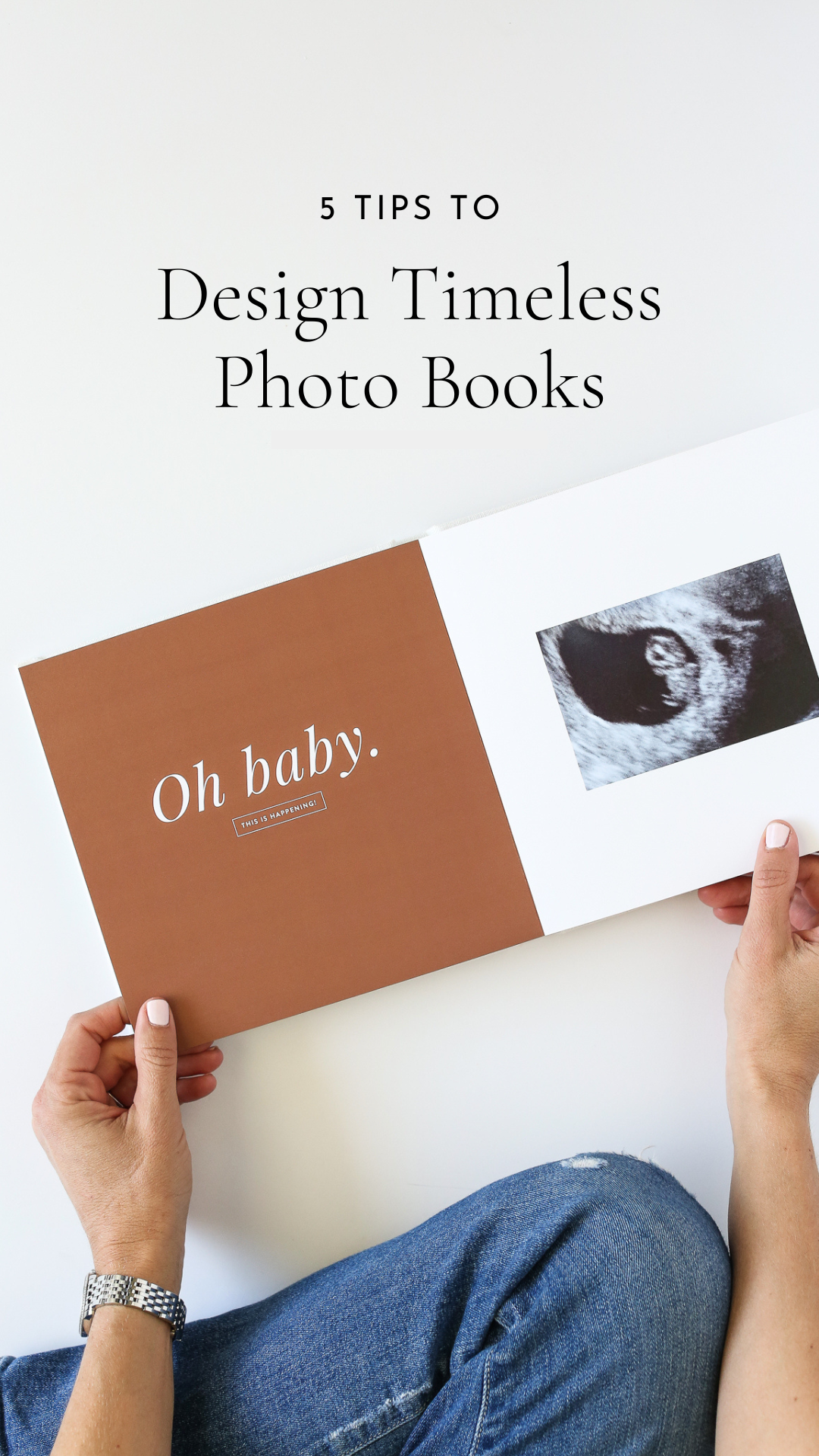
5 Tips for Designing Timeless Photo Books

Have you ever designed something and a couple years later cringed looking back at it? Me too.
Documenting your memories takes time and money, two incredibly valuable resources.
So if you invest both in designing a photo book, you want to enjoy it for years to come.
Here are five tips to design timeless photo books.
ONE
Include fewer photos.
I know there’s a little tough love involved with this one, but if there’s one thing that gives a photo book a more sophisticated look, it’s including fewer photos on each page.
There’s certainly a place for a collage or a series of photos on a page, but if you cram every page of your photo book with photos, your eye won’t know where to look.
In this case, less truly is more.
When you include fewer photos in your project, each memory gets more space. Your photos can breathe, making flipping through the project a more enjoyable experience.
Narrowing down photos is challenging, for sure, but if it’s the only thing you adjust, your photo books will immediately have a more timeless quality.
TWO
Add white space.
I love a page with photos that bleed all the way to the edges, but restraint and editing and not filling every nook and cranny of a project with things to look at instantly elevates the design.
Ten years ago, we moved from Nevada back to California. I was pregnant at the time, Nick was deployed, and we decided to live on the military base for the first time. Base houses are quite simple - white walls, neutral kitchens, “builder basic,” but a blank slate.
I considered putting lots of color on the walls before our furniture arrived, so I gathered photos from magazines for inspiration.
My mom pointed out that every room I liked was painted white, so the white walls stayed put and I’ve appreciated them in every house we’ve lived in since.
It’s not for everyone, but I like a mix of full color pages filled with one or more photos and pages with lots of white space.
I also like the juxtaposition of a layout with one large photo spanning the page adjacent to a layout with a few smaller photos in a grid with a wide, white margin.
This may just be my preference, but I do think when you include white space in a design, it keeps the pages feeling less cluttered, which makes them more timeless.
THREE
Incorporate simple storytelling.
Telling a story through photos and (a few!) words gives your photo books a timeless quality. You’ll want to reach for that project year after year.
Start with the photos
Choose photos that best tell the story of your project. They may not be the “best” quality pictures. One of my favorite shots I included in an old photo book was blurry, but it captured the moment perfectly.
You’re not curating a perfect representation of your family’s story, but a real one. And the “perfect” photo might be imperfect - so be on the lookout for those photos that drive the story.
Add a few words
I don’t think it’s necessary to caption every photo, but a few words at the beginning of your project or, even better, at the beginning of each chapter or section of your project will keep the story moving and remind you of details you might otherwise forget.
Break your book into “chapters” and add a title page to each.
In a baby book, that might look like chapters by season or month.
For an anniversary project, you might divide up a marriage into 5 or 10-year increments.
On each of those “title” pages, you could jot a few notes about the photos within or even include bullet points.
Let’s say you’re documenting a trip to Paris and you want to break it up by day. Create a page with text at the start of each day, give that page a large title with the day or date, and add some notes or bullet points with your itinerary that day.
It doesn’t take much writing or “journaling” to drive the story, fill in the gaps, and set the stage for your photos.
FOUR
Choose classic fonts.
I came to the world of memory keeping over ten years ago as a custom stationery designer.
At the time, I was pregnant with my first son and Googling ideas for what to do with the photos when I stumbled into the world of pocket page scrapbooking, hybrid scrapbooking, Project Life, etc.
When he was born, I started experimenting with layouts and incorporating text with photos, editing, using Photoshop for the first time.
I’ve simplified my process significantly since then, but something I loved then as a stationery designer and still love is selecting fonts to include in my projects.
If you’re adding text to a photo book and using their editor, then go with something simple. Some photo book vendors like Artifact Uprising and Milkbooks have really limited choices, so you can’t help but selecting something timeless.
But a website like Shutterfly will give you lots of options, many of them trendy. If you have lots of choices, consider the following when wading through your options:
Make sure the font is readable (i.e. don’t use a scripted font that’s too small)
Is this a style you’ve gravitated to for a long time?
Is this a font combination you’re seeing “everywhere” these days? (might be a little trendy)
There’s absolutely nothing wrong with incorporating trends, but they may date your project.
These are a few fonts I find myself going back to year after year:
Aleo
Lora
Brandon Grotesque
Bodoni
Open Sans
These don’t have to be your favorites, but I think my point is that some of these fonts appear in my original Project Life albums from 2011, and I still love them!
You’re the one who is going to enjoy these books for years go come - so choose fonts that you love. And if they’ve been around for awhile, they’ll feel timeless rather than trendy.
FIVE
Find what works for you.
You don’t have to reinvent the wheel, and sticking to certain design choices, like your tried-and-true fonts, will help you love your projects for years to come.
Experiment with what works for you, what’s pleasing to your eye, and then don’t be afraid to use those combinations time and again.
There are no strict design “rules” when it comes to putting together your photo books, but if you want your projects to feel timeless, you’ll need to pay attention to your personal preferences over time.
What types of magazines do you gravitate toward?
Are there cookbooks you love looking through? What fonts do they use? Do they have lots of white space? Bright photos? Color? Neutrals?
Scroll your Pinterest feed. What stands out to you? What catches your eye? Can you incorporate that style in your photo books?
Like my discovery, by accident, that I didn’t need to spend hundreds of dollars painting my white walls, paying attention to what draws you in over time will help you design timeless photo books.
And if you’re investing time, effort, and money in doing so, I think it’s worth considering what will be beautiful to you over the long haul.